
In today’s digital landscape, the ever-evolving world of technology has given rise to a new era where mobile devices have become an integral part of our daily lives. With the rapid advancement of smartphones and tablets, people are increasingly relying on these portable gadgets to access information, connect with others, and engage in various online activities. As a result, it has become imperative for businesses and individuals alike to adapt their websites to meet the demands of this mobile-centric era.
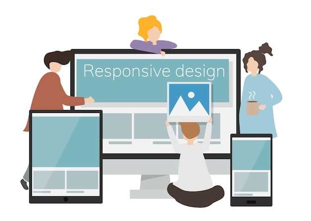
Responsive web design, a concept that has gained immense popularity in recent years, plays a pivotal role in ensuring that websites are accessible and visually appealing across a wide range of devices. By employing flexible layouts, fluid images, and media queries, responsive web design allows websites to automatically adjust their appearance and functionality based on the screen size and orientation of the device being used. This adaptability ensures that users can easily navigate and interact with a website, regardless of whether they are using a desktop computer, a smartphone, or a tablet.
One of the key advantages of responsive web design is its ability to enhance user experience. With the increasing number of people accessing the internet through mobile devices, it is crucial for websites to provide a seamless and enjoyable browsing experience on smaller screens. By optimizing the layout, font sizes, and navigation menus for mobile devices, responsive web design ensures that users can effortlessly navigate through a website, read content without zooming in, and interact with buttons and forms without any hindrance. This improved user experience not only leads to higher engagement and longer browsing sessions but also contributes to higher conversion rates and customer satisfaction.
Contents
The Evolution of Web Design in the Mobile Era
In the ever-changing landscape of technology, the way we access and interact with the internet has undergone a significant transformation. With the rise of mobile devices, web design has had to adapt to meet the demands of a more mobile-centric world. This evolution in web design has brought about a shift in the way websites are created and optimized for mobile devices, ensuring a seamless user experience across different screen sizes and resolutions.
As the use of smartphones and tablets continues to grow, web designers have recognized the need for websites to be responsive and adaptable. The traditional approach of designing websites solely for desktop screens is no longer sufficient. Instead, web designers now focus on creating websites that can be easily navigated and viewed on a variety of devices, from smartphones to tablets to laptops.
One of the key aspects of this evolution in web design is the use of fluid layouts. Unlike fixed layouts, which have a set width and do not adjust to different screen sizes, fluid layouts are flexible and adapt to the available space. This allows websites to resize and reposition elements based on the screen size, ensuring that the content remains readable and accessible.
Another important aspect of web design in the mobile era is the use of media queries. Media queries allow designers to apply different styles and layouts based on the characteristics of the device being used. This means that websites can have different designs for desktop screens, tablets, and smartphones, optimizing the user experience for each device.
In addition to fluid layouts and media queries, the evolution of web design in the mobile era has also seen the rise of mobile-first design. This approach involves designing websites with mobile devices in mind first, and then scaling up for larger screens. By prioritizing mobile design, web designers can ensure that the most important content and features are easily accessible on smaller screens, while still providing a rich and engaging experience on larger screens.
In conclusion, the evolution of web design in the mobile era has brought about significant changes in the way websites are created and optimized. From fluid layouts to media queries to mobile-first design, web designers are constantly adapting to meet the demands of a mobile-centric world. By embracing these changes, websites can provide a seamless and user-friendly experience across a wide range of devices, ensuring that users can access the content they need, whenever and wherever they are.
Understanding the Shift towards Mobile
In today’s digital landscape, the world is witnessing a significant transformation in the way people access and interact with information. This paradigm shift is characterized by the increasing dominance of mobile devices as the primary means of online communication and engagement. As society becomes more interconnected and reliant on technology, understanding the shift towards mobile is crucial for businesses and individuals alike.
The Rise of Mobile Devices
Gone are the days when desktop computers were the sole gateway to the online world. With the advent of smartphones and tablets, people now have the power of the internet at their fingertips, no matter where they are. The convenience and portability offered by mobile devices have revolutionized the way we consume content, communicate, and conduct business.
Moreover, the proliferation of affordable mobile devices has made them accessible to a broader demographic, transcending geographical and socioeconomic barriers. As a result, the number of mobile users has skyrocketed, with billions of people worldwide relying on their smartphones as their primary source of information and entertainment.
The Mobile-First Approach
Recognizing the growing dominance of mobile devices, businesses and website owners have had to adapt their strategies to cater to this new reality. The concept of a mobile-first approach has emerged, emphasizing the importance of designing websites and applications with mobile users in mind.
Responsive web design, a key component of the mobile-first approach, ensures that websites automatically adjust their layout and content to provide an optimal viewing experience across different screen sizes and devices. By prioritizing mobile usability, businesses can enhance user engagement, increase conversion rates, and ultimately, drive their success in the mobile era.
- Improved User Experience: Responsive design eliminates the need for users to zoom in or scroll horizontally, providing a seamless and intuitive browsing experience.
- Enhanced SEO Performance: Mobile-friendly websites are favored by search engines, leading to higher rankings and increased visibility in search results.
- Broader Reach: With a mobile-first approach, businesses can tap into the vast mobile user base and expand their reach to a wider audience.
- Competitive Advantage: By embracing mobile responsiveness, businesses can differentiate themselves from competitors and stay ahead in the ever-evolving digital landscape.
In conclusion, understanding the shift towards mobile is essential for businesses and individuals seeking to thrive in the digital age. By embracing responsive web design and adopting a mobile-first approach, organizations can harness the power of mobile devices to connect with their target audience, drive engagement, and achieve long-term success.
The Rise of Responsive Web Design

In today’s digital landscape, the ever-increasing prevalence of mobile devices has revolutionized the way we access and interact with the internet. As our dependency on smartphones and tablets grows, it becomes imperative for websites to adapt to this mobile-driven era. This is where the rise of responsive web design comes into play.
Adapting to Changing User Behavior
Gone are the days when people solely relied on desktop computers to browse the internet. With the advent of smartphones and tablets, users now expect seamless experiences across multiple devices. Responsive web design allows websites to dynamically adjust their layout and content to provide optimal viewing and interaction experiences, regardless of the device being used.
By embracing responsive web design, businesses and organizations can cater to the evolving needs and preferences of their target audience. Whether users are accessing a website on a large desktop screen or a small smartphone display, responsive design ensures that the content remains accessible, visually appealing, and easy to navigate.
Enhancing User Experience
Responsive web design goes beyond simply adapting to different screen sizes. It focuses on creating a user-centric experience that prioritizes usability and accessibility. With responsive design, websites can optimize their loading speed, minimize scrolling and zooming, and ensure that buttons and links are easily clickable, regardless of the device being used.
Furthermore, responsive web design allows for a consistent branding and messaging across all devices. By maintaining a cohesive visual identity and user interface, websites can build trust and familiarity with their audience, ultimately leading to increased engagement and conversions.
In conclusion, the rise of responsive web design is a direct response to the mobile-driven era we live in. It enables websites to adapt to changing user behavior and enhance the overall user experience. As the importance of mobile devices continues to grow, responsive design has become an essential aspect of modern web development, ensuring that websites remain accessible, engaging, and effective across all devices.
Benefits of Responsive Web Design
In today’s digital landscape, having a website that seamlessly adapts to different devices and screen sizes is crucial. Responsive web design offers a multitude of benefits that enhance user experience, improve search engine optimization, and increase conversion rates.
One of the key advantages of responsive web design is its ability to provide a consistent and optimized browsing experience across various devices, such as smartphones, tablets, and desktop computers. By automatically adjusting the layout, content, and navigation to fit different screen sizes, responsive websites ensure that users can easily access and navigate through the site, regardless of the device they are using.
Furthermore, responsive web design plays a significant role in improving search engine optimization (SEO). Search engines, like Google, prioritize mobile-friendly websites in their search results, as they aim to deliver the best user experience to their users. By implementing responsive design techniques, websites can achieve higher rankings in search engine results pages, leading to increased visibility and organic traffic.
Another benefit of responsive web design is its cost-effectiveness. Instead of creating separate websites or mobile applications for different devices, responsive design allows businesses to have a single website that caters to all users. This not only saves time and resources but also ensures consistent branding and messaging across all platforms.
Moreover, responsive web design contributes to better conversion rates. When users have a positive browsing experience on a website, they are more likely to stay longer, engage with the content, and take desired actions, such as making a purchase or filling out a contact form. By providing a seamless and user-friendly experience, responsive websites can significantly increase conversion rates and ultimately drive business growth.
In conclusion, responsive web design offers a wide range of benefits that are essential in today’s digital landscape. From providing a consistent browsing experience to improving SEO, reducing costs, and increasing conversion rates, responsive design is a crucial element for success in the ever-evolving mobile era.
Improved User Experience and Accessibility
In today’s digital landscape, creating a website that offers an enhanced user experience and ensures accessibility is crucial. With the ever-increasing use of mobile devices, it is essential to design websites that adapt seamlessly to different screen sizes and resolutions. By doing so, users can easily navigate and interact with the website, regardless of the device they are using.
Responsive web design plays a significant role in improving user experience and accessibility. By employing responsive design techniques, websites can automatically adjust their layout, content, and functionality to provide an optimal viewing experience. This adaptability eliminates the need for users to zoom in or scroll horizontally, making it easier for them to consume the information presented on the website.
Moreover, responsive web design ensures accessibility for all users, including those with disabilities. By implementing responsive design principles, websites can be made accessible to individuals with visual impairments, hearing impairments, or motor disabilities. For example, responsive design allows for the use of larger fonts and clear contrast, making it easier for visually impaired users to read the content. Additionally, it enables the integration of assistive technologies, such as screen readers, to provide an inclusive browsing experience for individuals with disabilities.
Furthermore, responsive web design enhances user experience by optimizing website performance. With the increasing demand for fast-loading websites, responsive design helps to minimize loading times and improve overall site speed. This is achieved by optimizing images, reducing unnecessary code, and utilizing caching techniques. By delivering a fast and efficient browsing experience, users are more likely to stay engaged and satisfied with the website.
In conclusion, the implementation of responsive web design is essential in the mobile era to ensure improved user experience and accessibility. By creating websites that adapt to different devices and cater to the needs of all users, businesses can effectively engage their audience and provide a seamless browsing experience. Embracing responsive design principles not only enhances usability but also demonstrates a commitment to inclusivity and user satisfaction.
Enhanced SEO and Increased Traffic
In today’s digital landscape, having a strong online presence is crucial for businesses to thrive. With the ever-increasing use of mobile devices, it is essential to optimize websites for mobile users. This not only improves the user experience but also plays a significant role in enhancing search engine optimization (SEO) and driving increased traffic to your website.
Improved Visibility in Search Engines
When your website is responsive and mobile-friendly, search engines like Google are more likely to rank it higher in search results. This is because search engines prioritize websites that provide a seamless experience across different devices. By incorporating responsive web design techniques, you can ensure that your website is easily accessible and navigable on smartphones, tablets, and other mobile devices. This, in turn, increases the chances of your website appearing in relevant search queries, improving its visibility and attracting more organic traffic.
Enhanced User Experience
A responsive web design not only benefits search engines but also enhances the overall user experience. Mobile users expect websites to load quickly and be easy to navigate on their devices. If your website is not optimized for mobile, it may lead to a high bounce rate, where visitors quickly leave your site due to frustration or difficulty in accessing the content. On the other hand, a responsive website adapts to different screen sizes and resolutions, providing a seamless and user-friendly experience. This leads to longer visit durations, lower bounce rates, and increased engagement, all of which contribute to improved SEO and increased traffic.
- Responsive web design ensures your website is accessible on various devices, including smartphones and tablets.
- Optimizing your website for mobile improves its visibility in search engine results.
- A responsive website enhances the user experience, leading to higher engagement and lower bounce rates.
- Improved SEO and user experience result in increased organic traffic to your website.
In conclusion, in the mobile era, responsive web design is not just a trend but a necessity. By implementing a responsive design, you can enhance your website’s SEO and attract increased traffic. This, in turn, can lead to higher conversions, improved brand visibility, and ultimately, business growth in the digital landscape.
Cost-Effectiveness and Time Efficiency
In today’s digital landscape, businesses are constantly seeking ways to optimize their online presence and reach a wider audience. One crucial aspect of achieving this goal is ensuring that websites are cost-effective and time-efficient. By implementing responsive web design strategies, companies can enhance their online platforms without incurring excessive expenses or wasting valuable time.
Streamlined Development Process
Responsive web design allows for a streamlined development process, eliminating the need to create separate websites for different devices. Instead, a single website can adapt and adjust its layout and content based on the screen size and resolution of the device being used. This approach not only saves time but also reduces the complexity of managing multiple versions of a website.
Reduced Maintenance Efforts
With responsive web design, businesses can significantly reduce their maintenance efforts. Rather than maintaining separate websites for desktop and mobile users, updates and changes can be made once and applied universally across all devices. This not only saves time but also minimizes the risk of inconsistencies or errors that may arise from managing multiple versions of a website.
Moreover, responsive web design eliminates the need for separate SEO strategies for different versions of a website. By consolidating all SEO efforts into a single website, businesses can optimize their online presence more efficiently and cost-effectively.
- Responsive web design streamlines the development process.
- It reduces maintenance efforts and the risk of inconsistencies.
- Businesses can optimize their online presence more efficiently and cost-effectively.
In conclusion, cost-effectiveness and time efficiency are crucial considerations in the mobile era. Responsive web design offers a solution that allows businesses to enhance their online platforms without incurring excessive expenses or wasting valuable time. By streamlining the development process and reducing maintenance efforts, companies can optimize their online presence more efficiently and effectively.


